Making a Brand — Designing the Right Logo
In the same way that ‘the clothes make the man’, picking the right logo can make or break a brand. We know McDonald’s by its golden arches, Nike by its Swoosh, and Apple by its namesake. Despite their simplicity, these logos have become an iconic representation of their respective brands, with little to no changes made through the years.
But what does it take to design an iconic brand logo? How does design make a lasting impression on audiences? It takes more than just an eye-catching picture or a vector icon from a royalty-free library. A logo is oftentimes the first touchpoint an audience has with a brand. It’s the first thing that catches their eye and keeps their attention. Getting your brand’s logo right is vital to drawing in and keeping a crowd.
Design with meaning
Some brands include clever messaging and images-within-images in their logo design. FedEx, for example, hides a forward-pointing arrow (see the black circle in the image below) to indicate their constant movement forward both as a courier delivery service and as a brand.
![]()
Other brands pay homage to their origins. BMW, now known as an automobile company, was originally founded to manufacture aircraft engines for the German military during World War II. Its blue and white logo design calls back to the movement of a propeller with the sky behind it.
More than imagery; typography
The typography of your brand is just as important as the image design itself.
A brand’s typography speaks to its personality. Making the right choice between a serif and sans serif font defines the tone of your brand. Recognisable fonts like Helvetica, Times New Roman, and Comic Sans all depict vastly different brand tones — the latter being the one viewed as the least professional.
Choose a font that matches your brand look, feel, and message. Then, establish a consistent brand code around the aesthetic of all internal and external typography as this will give your brand a sense of consistency and trust.
Don’t underestimate the relationship between typography and trust: a recent study on the importance of font found that the use of Baskerville had a marked impact on the perceived trustworthiness of a quote.
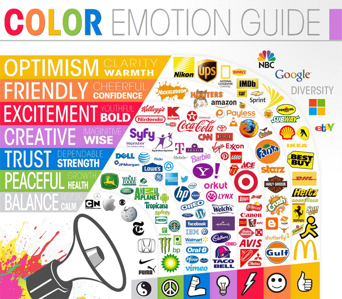
Choosing the right colour palette
Colour is also one of the ways a brand showcases its personality. Choosing the right colour scheme increases brand recognition among audiences.
Bold and bright colours depict youthfulness and vibrancy, whereas darker tones of blue evoke dependability. Brands often choose complementary and contrasting colours — McDonald’s yellow on red or Coca-Cola’s white on red, for example. With logos that use multiple colours like Google, accent shades and similar hues tend to be the best way to go.
The Logo Company illustrates this with its logo colour wheel of famous brands and their palettes of choice:
Putting it all together
A logo should carry meaning for a brand, whether symbolically or literally. A logo should communicate positive connotations about your company, its philosophy and products. It should be as memorable as the brand itself but a good brand logo is also more than just memorable — it’s immortal.