More Than an Acronym — IKEA’s Journey Mapping and Customers
When people think about IKEA, they tend to fall within one of two categories of emotion — pure glee or absolute dread. Depending on who you ask, a trip to IKEA can either be the highlight of their week or the lowest point of it. In spite of the bustling crowds commonly associated with a venture into the world of IKEA, it remains the world’s largest furniture retailer and one of the most loved businesses worldwide.
Aside from their vast array of ready-to-assemble home furniture and delicious Swedish meatballs, how does IKEA keep their customers happy from a business perspective?
Customer journey mapping comes to life
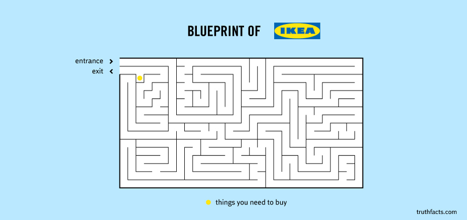
If the customer journey is considered a roadmap, then IKEA’s been taking it to the next level. There’s more to their carefully laid out floorplans than aesthetic. IKEA’s floorplan is, in fact, a very carefully curated labyrinth that brings the customer journey to life. Its layout of room displays, conveniently placed boxes of their trademark blue shopping bags, tiny pencils, measuring tapes, and catalogues all play a part in creating an interactive and intuitive purchasing experience in-store.
Customers walk through their displays, test out their goods, and take note of where in their towering warehouses each piece is stored.

It’s funny because it’s true. Right?
IKEA’s level of genius isn’t just about trapping their customers within a seemingly inescapable maze with only one exit. Granted, some people may feel that way, but their floor plan allows customers to experience every product available — and at their leisure.
Holding their hands, but from a distance
Despite appearances, IKEA’s setup features a significant amount of guidance along the way to help their customers through the journey. Touchpoints are set up at every step of the journey. As mentioned above, IKEA features several locations where tiny pencils and measuring tapes are readily available. Aside from that, customer service and interactive IKEA information hubs are placed in easily noticeable areas to help customers seek out what they’re looking for. Arrows on the floor, overhead signage that indicate directions — these seem like basic fundamentals of any retail store, however remains a touchpoint for IKEA’s customers.
Maze with a meaning
The maze of showrooms that IKEA has built serves a purpose that might seem a little transparent at this point. It’s about painting the bigger picture; of putting things into perspective in relation to how each piece of furniture sits within a home environment.
The showrooms provide their customers with an interactive experience that focuses on their brand and its products. Additionally paired with other complementary pieces of furniture or home goods, this further boosts chances of purchases being made, or rather, increases the likelihood of conversion. Because the layout of the showrooms is a little tedious to manoeuvre more than once, customers are encouraged to make quick conversion decisions in regards to their purchases.
In layman’s terms: IKEA is a haven for impulse buying.
That isn’t to say that impulse purchases are a bad thing. One can never have too many food storage clips and scented candles. Customers are encouraged to make drive-by purchases — grabbing things as they pass in order to prevent the need for another round through the maze.
IKEA shoppers don’t seem to mind these marketing and sales tactics all that much. No matter the size of their purchases, they’re getting value out of their conversion one way or another. A cheap, high-quality product is worth the adventure.
And if nothing else, there’s always Swedish meatballs!